Building the Boxes 

So far I have made around 5 boxes. I’ve started to make bigger boxes as the others looked too small in comparison to my studio space. I will be using the smaller boxes at the top of my centre structure and the bigger boxes will be at the bottom of the structure so that the smaller boxes have a steady surface to build up on.

I am making sure that the boxes reflect the patterns, colours and fabrics that are used in the patchwork that will be surrounding the centre piece.

Dan Flavin

Dan Flavin was an American minimalist artist famous for creating sculptural objects and installations from fluorescent light fixtures. Flavin’s fluorescent structures explore colour, light and sculptural space. Flavin focuses on how light and colour can transform an exhibition space. Although he slowly developed his work into site specific installations rather than a gallery space.

I am interested in how colour and light itself can create a sense of space and change a space into something new. I also enjoy how his work is purely about transforming a space, and no deeper meaning. I feel that this relates to the work I am creating, as it is based on how colour can create a sense of illusion and overpower-ment.

Creating patchwork boxes

For my degree show installation piece, I wanted to create something that could go in the centre of my patchwork walls that clashed with the walls. I wanted this to be something that a viewer could walk around and make their own connections of colour and pattern that is reflected in both the walls and the objects. After looking at artists who worked with using stacked boxes to create a sculpture, I felt this suited my style of work and the vision I have for my outcome. I want the boxes to reflect parts of the patchwork wall to create a clashing inclosing environment. I also wanted to explore a way of making this even more visually confusing by adding mirrors to some of the boxes so that they can reflect the patchwork surrounding. I want these boxes to be stacked in the centre of my piece as high as the surrounding walls. I may have to create a base or structure to stack them on as I could have the risk of them falling down if they aren’t supported properly. This is something I will be trialling over the upcoming weeks towards my deadline.

Expanding patchwork

I have been further expanding the patchwork to fill the walls of my installation space. I will be putting it up in the studio soon to see how much more I need to make to fill the space and whether I need more fabric or not. I am interested in how this is looking so far and feel that it is very clashing and overpowering. I hope this is reflected when it is displayed in my space. I am considering painting the walls behind my piece a grey toned muted colour to help the work stand out against it, as I don’t want any white walls around it looking brighter than the fabrics used as this could take away the sense of psychedelic I want to create.

Psychedelic Art-Bruce Riley

After being told that my work is confusing people’s vision due to the contrasts in colour playing tricks on the eye. I decided to look at artists who create work based on the psychedelic and how colour and colour only can create such saturated illusionary forms. 

I came across a video of Bruce Riley at work. Riley fills canvases with organic shapes formed by dripping paint onto poured resin. The results are intriguing. Riley talks about how the work forms itself, how he selects colours that he feels will go well together. Sometimes they work sometimes they don’t. The process is never planned, just an assumption of what colours create the best outcomes.  

I feel that this has been the case with my current patchwork piece. Some areas cause my eyes to flicker between the colours and other areas of the piece do nothing at all. It’s just trial and error and comparing what fabric or colours work best. Something that has definitely helped me is asking other students what parts they feel more impacting. This gives me an idea of what people react to most. 

Bruce Riley on psychedelic art and colour.

https://youtu.be/v3RcRwCP0RU

Enter the Void-Psychedelic Film

I watched several clips from the rather disturbing ‘Enter the Void’ purely for the psychedelic imagery that came with it. Gaspar Noé’s visual effects in this film are hallucinatory and intrusive. Watching these clips were very difficult on the eye but beautiful at the same time. The use of intense colour with bright lighting and often spinning motions create intense visual distortions and often blurring within my vision anyway. The wobbly filming combined with all these things makes the film really uncomfortable to watch.

Image result for Enter the Void


Developing patchwork further

For my degree show piece I am furthering the idea of using patchwork to create an illusion-like effect on the viewer. Developing from my first patchwork piece, I have added more patterned fabrics, contrasting colours and different textures to give the work more dimension. I want the work to be over-board and in your face, making it difficult to look at. I feel that the use of different patterns that contrast one and other really give this effect for me. Working with these colours and patterns definitely play with my vision, after a while they cause a flickering especially in the corner of my eye when focussing on another piece. I feel that an installation space filled with patchwork will be very hard on the eye, especially if the lighting in the space is bright enough to light up the fablon sections of my work (similarly to the photograph below.)

Large Patchwork trial 

As my patchwork jacket was having the most attention at my tutorials, I felt that this was a sign to develop patchwork further. It is a great way of contrasting colours side by side as well as adding extras to create more of an illusionistic appearance. As the circle has been something that has been repeated throughout my work I instinctively used circles and the empty space where a circle was once cut to create visual happenings through the colour and fabrics of these appliqué style attachments. I’m interested in really highlighting the trickery that complementary colours cause on the eye. I feel that using stronger lights could intensify the piece and definitely show the difference in fabrics especially the fablon in comparison to the cotton. 

I know from creating this piece that I want to create more and form an installation of them for my degree show piece. 

Amanda Browder

Born in Missoula, MT in 1976, Amanda Browder received an MFA/MA from the University of Wisconsin at Madison and taught at the School of the Art Institute of Chicago. She currently lives and works in Brooklyn, New York producing large-scale fabric installations for building exteriors and other public sites. htp://www.amandabrowder.com/index.php?/cvcontact/about/

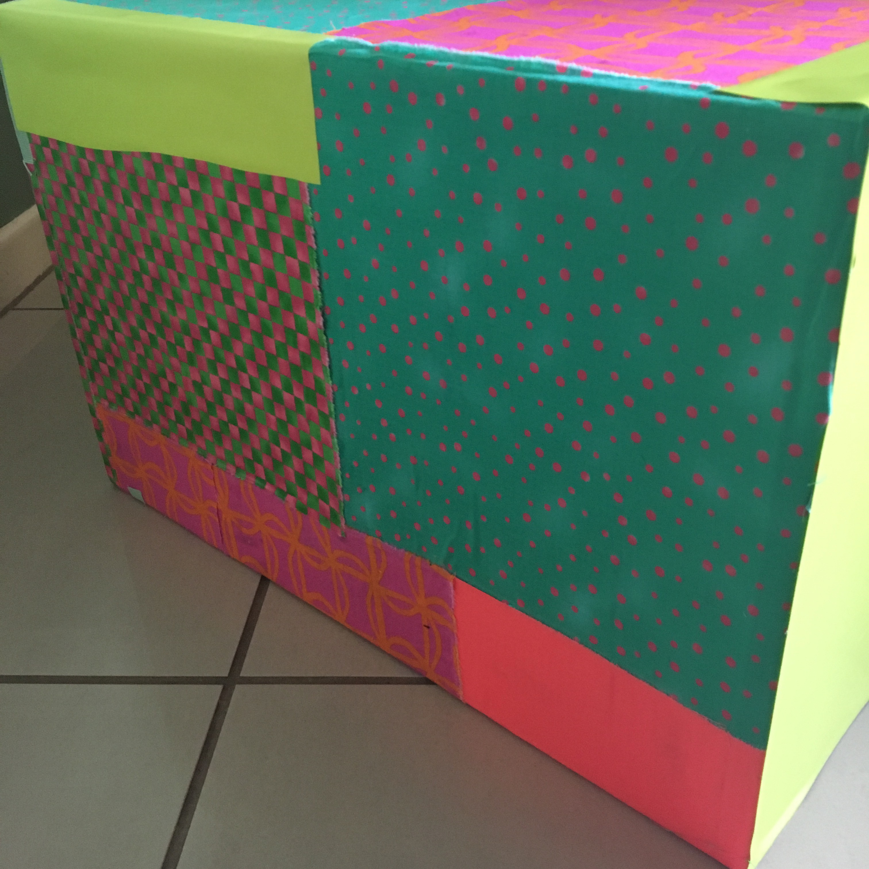
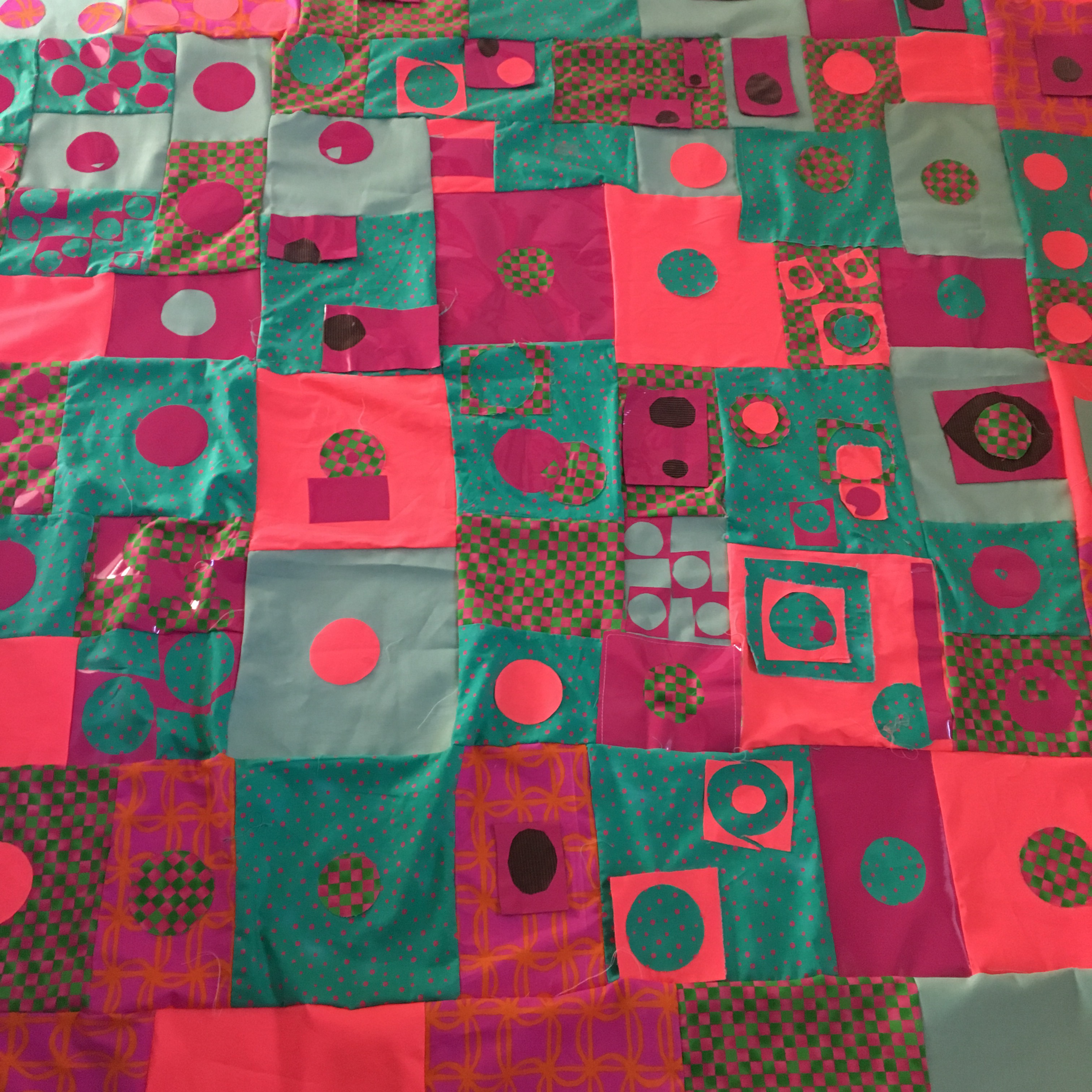
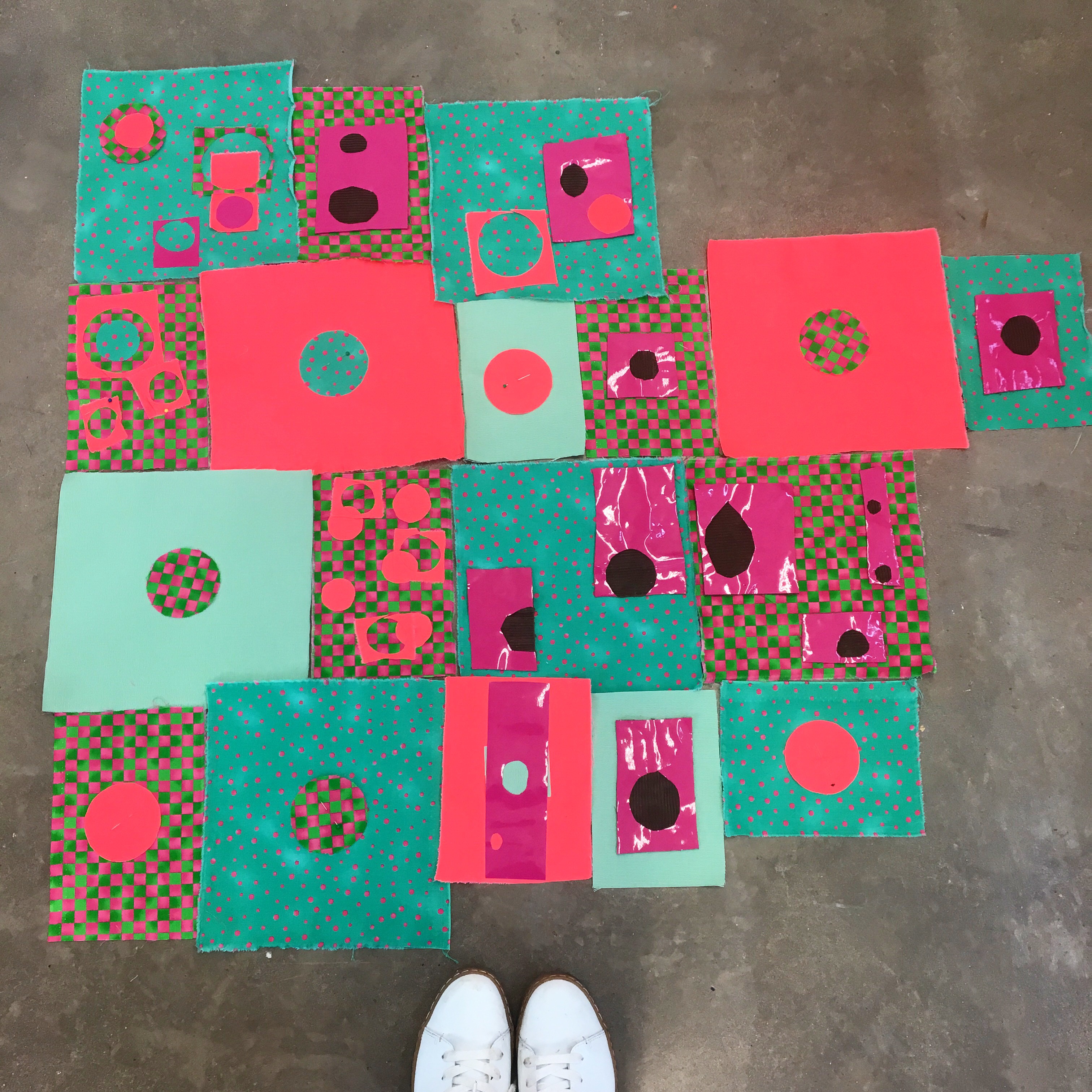
Browder is most known for her large patchwork pieces that she displays on buildings, vehicles as well as smaller scale gallery pieces. Browder uses a combination of found and bought fabrics to create her patchwork installations, making colour and pattern a main feature of them. Browder’s installation reflect abstraction and minimalism. Her forms are based on comic book imagery. She uses the transformative nature of materials and how familiar objects can combine to create abstract relationships. Her pieces create a psychedelic experience through bright colours and familiar materials to recreate a change in perception.

Although I could never imagine making work on such a large scale, I am inspired by her use of colour to create an impact to a place or to a viewer. How the patchwork can transform a space and give it a new perspective.

Image result for amanda browder

Image result for amanda browderImage result for amanda browder


Valentino Resort 2015

After looking at clashing colours and fabrics, I came across the Valentino Resort 2015 collection. This collection revolves around colour, patchwork and clashing, this is something I am interested in in my own work. The combination between pattern and patchwork create a psychedelic appearance that makes it difficult to look at. I am interested in similarly creating pieces that clash with my background pieces through colour and shapes. I feel this is a good way to create a space connected by colour. I am also interested in how this creates an illusion to what is foreground and background this formed by the repetitive use of the same colours and patterns.


Image result for valentino resort 2015

Image result for valentino resort 2015

Image result for valentino resort 2015